


The Biobot
Designing ease for machine learning
Introduction
Created by a team of medical professionals, Biobot is an emerging opioid prescribing tool geared towards helping healthcare providers use AI technology to recommend opioid drug dosages for patients after surgery.
“In our department of orthopedic surgery, opioid prescribing is a big issue. We wanted to create a tool that can hopefully help providers prescribe these pain-killers in a way that reduces addiction risks.”
-Member of BioBot team
Business Challenge
Biobot approached our team with a request to optimize the design of the pre-logged in experience on their website and improve the UX of the Pain Management portal. We worked within a two week timeline.

My Role
I wrote testing scripts and held testing sessions with 9 participants in the medical field. Additionally, I was responsible for the product strategy and visual design of the wireframes and prototypes. We worked within a two week design sprint.
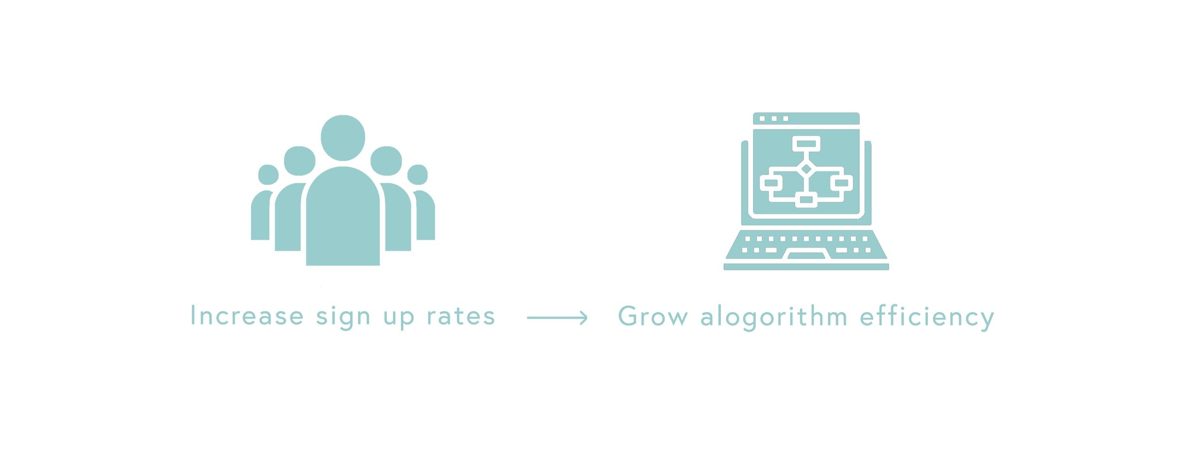
Measure of Success
The client’s measure of success was that:
by increasing sign up rates, we could increase their user base of prescribers,
therefore the algorithm will increase in efficacy and lead to greater outcomes for providers and patients.
Research Process
After conducting a stakeholder interview to better understand business goals, current pain points, and opportunities for improvement, we knew, as a team of UX designers — not medical professionals — that in order to make sense the problem space we needed to discover:
an understanding of what BioBot’s target users actually needed,
a clear definition how the current BioBot website delivered on its proposed solution.
We employed a number of research methods to understand stakeholder and user needs:
Site Audit
We heuristically audited the current site, capturing existing functionality requirements and content specs.
Competitive Research
A feature analysis of comparable companies helped us determine what elements of the site were standard within the problem space.
User Testing
We spoke to as many medical professionals as possible throughout our two week design sprint, employing user interviews during every phase of the design process.
Initial user interviews
We started by conducting initial user interviews to better understand the problem space and how users were currently solving for the problem.
Based on our initial interviews, we were able to define 3 main areas of opportunity based on major pain points involved in the problem space.
What we heard:

The shadow of the opioid crisis:
“In the back of my head, I’m always thinking about the opioid crisis when interacting with a patient to prescribe opioids.”

The limits of time between provider and patient:
“... so for a 30 step form, that’s 60 extra clicks. There’s a lot of room for mistakes and my time is very limited.”

The subjectivity of pain:
“Pain is subjective and it manifests in different patients differently.”
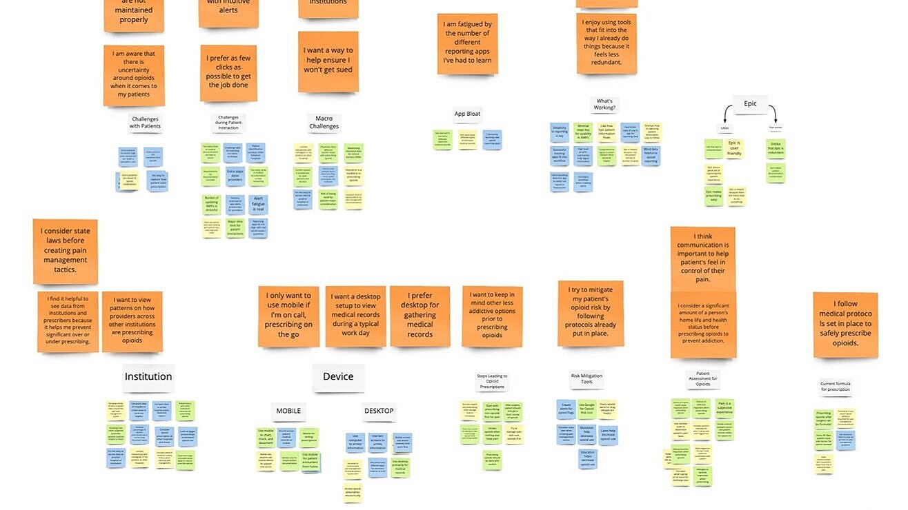
Synthesizing the Research
Based on the site audit, our generative research of the space through user interviews and testing, and competitive research, I lead a Miro board affinity mapping exercise, which lead us to these conclusions:
The severity of the opioid crisis couldn’t be overstated, felt deeply and confirmed by all medical professionals in our testing. Creative ideas are apt to help contribute in helping to solve the problem, and our testing confirmed that the BioBot stakeholders were on the right track by offering a solution in the problem space.
However, when auditing and testing the current site, there was a major problem with clarity. Not a single medical professional tested could identify what the site was or what, exactly, BioBot did.
Within the logged-in patient portal, our testing showed poor product design that was inconsistent with the expectations of electronic medical records within the problem space.
Further, when considering the layers of complications when filling out EMRs (Electronic Medical Records), there arose an existential question about the product itself: would users be willing take on a completely separate flow to access the BioBot portal?
This question got us closer to one of the major problems within the space - the limits of time spent interfacing between doctor and patient is incredibly constricting.
To solve for the problem currently, seasoned orthopedic surgeons rely on tried and true formulas, opioids they know and trust. However, if a doctor prescribes too little, this can lead to lower patient outcomes, while overprescribing opioids can increase the risk of addiction.
On the other hand, our testing showed that younger surgeons were open and eager to use a tool that could help them prescribe opioids safely and effectively.
Therefore, our team knew we had to design the product to be both as appealing and valuable as possible to our target audience.


Diving Deeper: Persona
In order to stay focused on our specific target user, we narrowed in on one main persona for our problem area based on our research and stakeholder goals.
Our persona is an Orthopedic Surgeon Resident in a busy hospital in New York City. With limited time available to spend with patients, they rely on their own medical experience, learning from colleagues, and following hospital and state regulations already set in place to prescribe opioids to their patients. They want to be as confident as possible when prescribing opioids by dialing in on a standard that is easy to use and supported by strong data.

Strategy
We made sure to consider how our design could:
encourage greater sign up conversion rates from the home page,
eliminate friction and unnecessary time spent in the logged-in experience of the patient input and recommendations pages.
Design Process
Design Studio
As a team, we held a design studio to sketch out our initial concepts for layout and form.

Style Guide
We chose colors that would be appealing for users across a wide base, as scalability between institutions was a stakeholder goal. Our color palette represents credibility, trust, knowledge, power, professionalism, cleanliness, calm, and focus, and it is most often used in the medical field.


Mockups and Time Constraints
Because of the limitations of time in our design sprint, our team took our designs from low fidelity to high in order to prototype and test our assumptions.

Wireframe mockup of home page.
Prototype
Full Site Walkthrough
Testing Results
Increased credibility and communication
In our initial product tests, not a single tester could identify what the BioBot was or how it worked from studying the home page. Post redesign, every user tested could summarize and identify what services the BioBot offered and how it could help them in their workflow. This will help with conversion rates, as users can actually understand the product and why they want to sign up for it.
100%
A measure of success from our testing on 9 medical professionals is that 100% of users commented on the effectiveness of the clean layout, the ease of navigation, and how the minimalist UI style differs from the current industry standard, allowing for faster use and efficient results. Eliminating friction and unnecessary time spent in the logged-in experience of the patient input and recommendations pages was a main goal, and we achieved that with our streamlined design.
7 out of 9
7 out 9 of the users we tested said they would use this tool to help how they prescribed opioids. We ran up against detractors from more seasoned surgeons who relied on tried and true methods. Therefore, our recommendation to the client was to focus their marketing efforts on medical professionals newer to the field who would be more amenable to new methodologies.
Final Thoughts
As this was the final client project for my bootcamp program, it was incredibly intimidating to receive the brief. The subject matter was complex, to say nothing of being able to schedule interviews and usability tests with busy medical professionals.
However, this project ended up being a positive learning experience in how to approach any topic, no matter the complexity, with UX design principals, allowing my team to uncover the problem and find a way to get to a solution that delivered both for the users and on the business outcomes.