

BigNightIn Entertainment
Capturing credibility and delight on the virtual stage
Introduction
BigNightIn Entertainment provides entertainment, virtually, by representing performers and planning and holding online events. Founded by a team of seasoned NYC entertainment professionals, my team was brought on to create a website experience that mirrors that of a BNI Entertainment event experience, with a focus on functionality as well as brand identity and voice.

My role
Along with my team, I helped shape the overall product design and content strategy.
I was responsible for user interviews, testing, research synthesis, and all content on the web redesign. Additionally, I helped my team create wireframes, a clickable prototype, and presented design changes to company stakeholders.
Our team worked within a three week design sprint.
Goal
The business goal was to increase conversion rates for booking corporate events.

Me!
Research Process
We began by conducting a stakeholder interview to better understand business goals, current pain points, and opportunities for improvement. Then, we employed a number of research methods to understand organizational and user needs:
Site Audit
We audited the current site, capturing existing functionality requirements and content specs.
Competitive Research
A feature analysis of comparable companies helped us determine what elements of the site were standard within the problem space.
User Testing
We focused on testing the current site on 12 users with experience booking events on behalf of corporate clients, not personal reasons to align with the business’ goals.
Key Findings
Based on our research, my team identified these key problems.
The current website was not clear: users were confused what BNI Entertainment actually does or how it works.
The current website was not communicative: the tab navigation was confusing and did not follow industry standards, so users didn’t know where they were when browsing.
The current website was not delightful: although delight is subjective, it’s a major factor in how a person chooses a performer that they hope to be successful. A delightful performance is a successful performance.
There was a lack of an obvious starting point, so users were unable to navigate through and begin reviewing performers without friction or bounce back.
There was no way to discern whether a particular performer would be appropriate for an event without the user leaving the site to do their own research on an individual performer.
And finally, it was unclear how the event would actually work or what the user was responsible for on their end.
What we heard in user testing:
“I see a bunch of pictures, but it doesn’t give me any information."
“I’m not looking for performers that I would find interesting, I’m looking for one that will make that biggest splash when I announce it to my company.”
“After I booked something, I wouldn't be going to the website to get answers. I will be emailing my contact to get answers.”
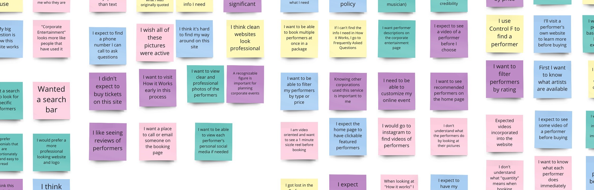
Synthesizing the Research
In order to better understand the insights gleaned from our initial research, I led an affinity map exercise on Miro with my team. From that practice, we could better understand the unique considerations for booking a corporate event:
Users need to know that the performer they choose will be appropriate for a professional setting, and expect that they can preview a performer with video before selecting.
The lack of a clear starting point when selecting a performer, such as highlighting corporate-friendly performers or a corporate call-to-action message early in the user flow, causes the user to spin their wheels while searching, threatening potential drop off.
Users expect to customize their event to their corporation’s needs, and thereby do not expect to immediately book on the site, but instead connect with a BNI Entertainment stakeholder who can take care of the planning.
The current site’s design, including color and font choices, did not convey credibility or trust to a corporate audience.
Because the majority of the performers currently represented are generally unknown, users need to see that BNI Entertainment has been vetted by showing what other companies BNI Entertainment has worked with.
Users expect to utilize search functionality to find a corporate-friendly performer.
Diving Deeper: Persona
In order to stay focused on our specific target user, we narrowed in on one main persona for our problem area based on our research.

Journey Map
To better understand the user’s journey and identify opportunities through pain points, we created a journey map.
Strategy
Based on our research, we knew the new site needed to:
Provide persistent and consistent messaging that makes it clear what BNI Entertainment does and how the service works
Create easy starting points for users to browse performers
Offer opportunities for users to preview a performer
Be communicative of where the the user is in the site flow
Ensure immediate credibility and trustworthiness
Present moments of delight
We hypothesized that by building credibility and providing trustworthy, clear solutions for booking, thereby reducing confusion of the site and eliminating bounce rates, we could improve the booking experience for users and increase conversion rates.
Design Process
User Flows
We stripped the flow down to the essential information needed to book a performer on the current website.

By capturing the current booking site flow, we were able to visually record the numerous points of friction and risks of drop-off. There was currently no clear and obvious path to completion for the user. While completing the booking process was within our MVP, our user expected more communication on what the booking process looked like, as well as a more robust mode of confirmation and help resources when booking an event.
Wireframes
We then held a design studio with our team to draw out a few of the key screens in order to determine which features were pivotal MVPs in our redesign.
When scaling from our design studio to mid-fidelity, and then to high-fidelity, the cycle of user testing and iterating was crucial. We tested regularly at each point in the design process by holding user tests over Zoom.

Style Guide
Before beginning our high fidelity design, we knew that the style guide of BNI Entertainment needed to be revamped in order to reflect the needs of the BNI stakeholders and the expectations of the desired user.
Here is the original home page primary navigation and footer:


We researched and ultimately chose colors that would represent the main characteristics of BigNightIn Entertainment, including:
entertainment,
night,
magic,
and professionalism.
The primary color we chose (#161459) sets the scene for a night in, while purple conveys magical, otherworld-ly vibes, and the red highlight for major call to action buttons keeps the eye moving and interested.

We chose Helvetica font as a cheeky nod to seriousness. While it has corporate bones, it still feels fresh and modern.
Redesigned header and footer
In addition to color changes, we recognized a need to make the navigation bar and the footer more visually connected to help aid in friction-less navigation.
We simplified them by making them the same color and left aligned the BigNightIn Entertainment place-holder logo (to be designed by the BNI graphics team).
From our research, we found that users explored multiple pages in order to glean the relevant information they needed. We simplified the navigation to reflect the behaviors of our user tests.

In the footer, we added a location and a place for a phone number which would add a layer of credibility and an additional path to communication.
We also added the social icons to the bottom right, which is more of the industry standard.

Key Improvements
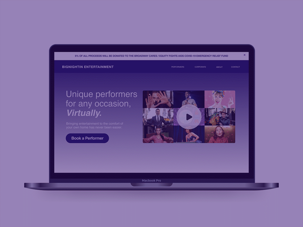
Home Page
Our primary design goals when addressing the home page were to provide multiple clear starting points, build credibility, and offer a touch of delight. In doing so, we:
created space for a video introduction that gives a sense of the “vibe” and necessary basic information above the fold,
designed an affordance by featuring artists in order to give the user another distinct starting place,
highlighted a call to action inviting the user to contact BNI Entertainment and begin the event planning process,
built in multiple locations, including here on the home page, for reviews and corporate clients BNI has worked with to maximize credibility.

A short description of BNI Entertainment immediately above the fold grabs the user's attention, conveying the sense that this is "the start of the show".

Our testing confirmed that a teaser video showing how BNI Entertainment works is a effective way of demonstrating to users what to expect when booking.

Along with the video and text, we added a “call to action” button above the fold to allow users to immediately go to view the performers, offering a distinct starting point to the flow.

Knowing that the lack of a distinct starting point was an issue for users, particularly when browsing through performers that may not be well known, spotlighting featured artists helps to guide the user in a more effective way.

We also knew that a “Zoom” performance might seem like a foreign concept to some. So, including live photos was important to show what to expect.
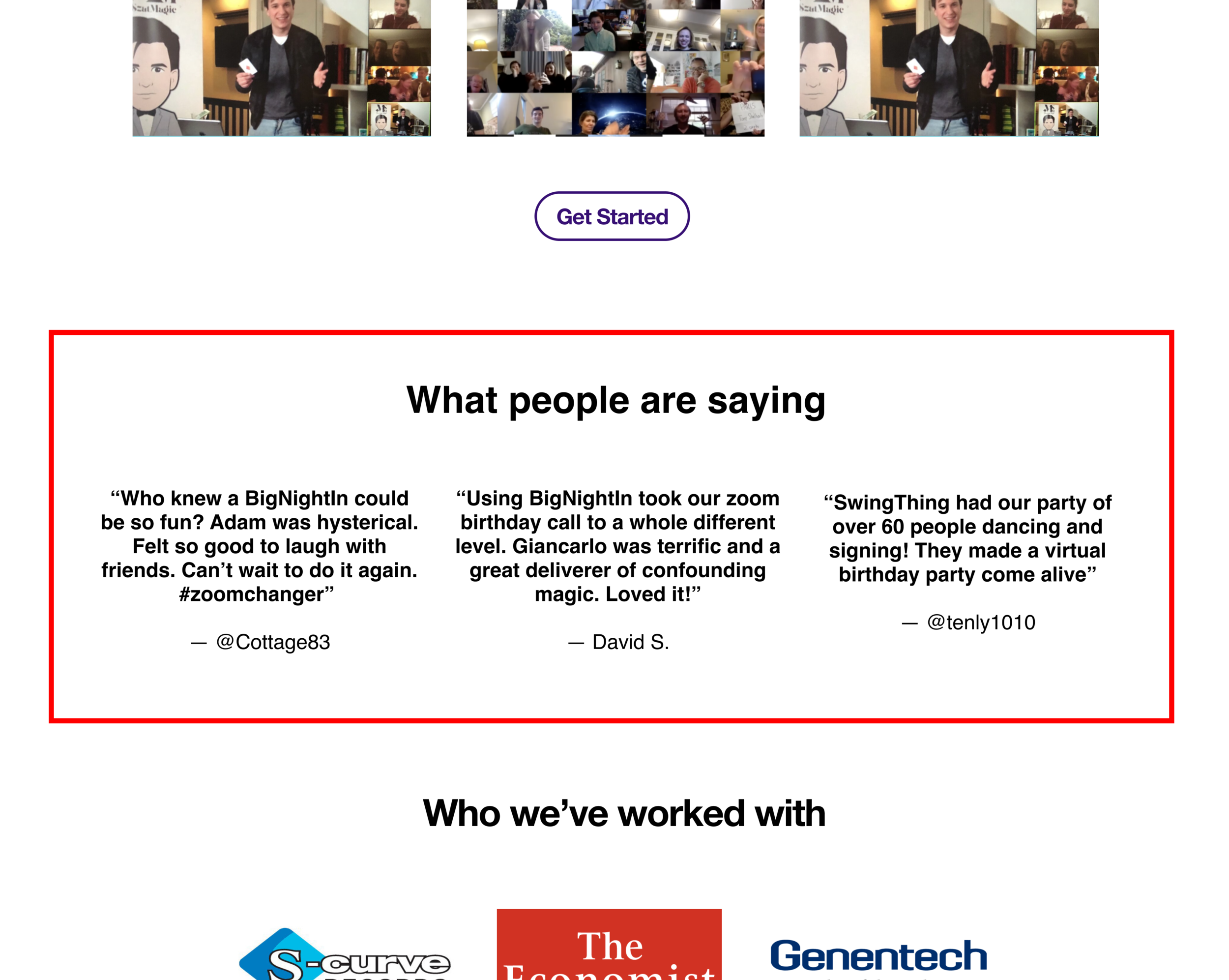
Adding reviews from real users who have previously used BNI's services adds credibility.

Throughout our research, users continuously asked, for credibility's sake, if they could see what other companies BNI has worked with.

BNI Entertainment's home page before redesign.
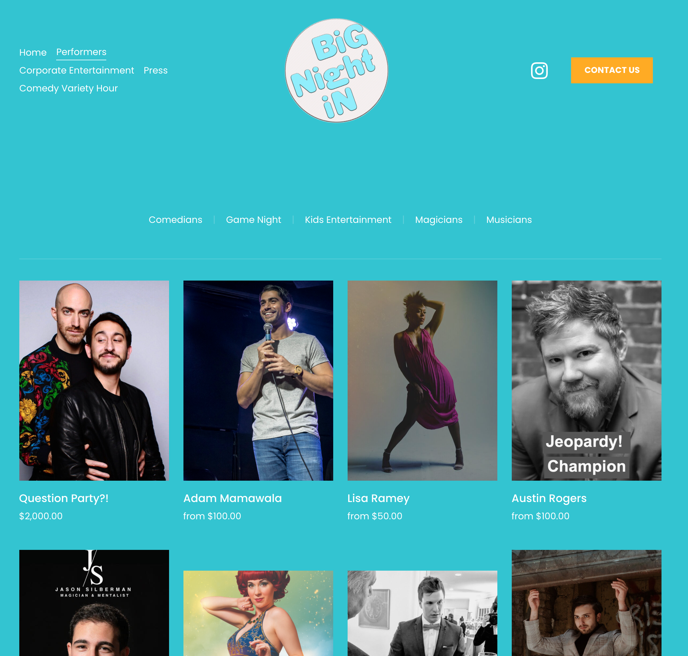
Performers Page
One of the biggest issues that users had with the performers page was the fact that if they knew of a name of a performer, they had to scroll all the way through the list to be able to find it. So, we added:
a search bar for easy browsing,
and clear tags on each individual performer to make it easy for the user to discern differences.

Adding a search bar prevented the endless scroll users used to take when finding a performer.

We increased the size of the top categories bar so that users could easily recognize the pages.

Under each of the performer names, we added an indicator of the type of performer to help the users understand what kind of talent they are looking at before clicking.

On each of the performers page, we learned through our research that users often felt overwhelmed by the amount of choices and not knowing where to start, so we linked a simple inquiry form.
Original Performers page.
Individual Performer Page
On the individual performers pages, we found that there were significant issues for users being able to get a sense of who these performers were simply by looking at the pictures on the website. In our design, we:
highlighted a sizzle reel or other introductory media,
made clickable, scrollable reviews easy to see above the fold,
to encourage browsability, we added similar artists shown below.

Adding videos of the performers previewing their craft help give a greater understanding of what each person does in front of an audience.

We added a “booking inquiry” form to replace the “book” button, which indicates that they still have to talk to BNI management before booking a performer.

Users also often felt overwhelmed by the amount of information in the bio. So, we made this feature scrollable to allow the user to either read more, or simply continue with the option of watching the different types of media.

Reviews were one of the most significant elements of the judgement process from our users. We made the reviews easy to flip through just below the fold.

Lastly, having a next step was important for encouraging users to continue browsing. A section of similar artists was added at the bottom of each page.

Original Individual Performer page.
Corporate Page
In our initial product walkthrough, we found that when asked to book a corporate event for their company, users went directly to the Corporate Entertainment tab — which originally didn’t offer much more than simply showing what companies BNI Entertainment worked with.
We knew we needed to focus our efforts on demonstrating how a corporate event would actually work for this page.

We gave a little more context to the page and added an action item to help users get started, which leads them to the inquiry form.

A video geared towards corporate clients illustrates the planning process and what the event itself will look like.

We kept the company logos previously displayed, but made it a scrollable in order to take up less of the page and give the user the opportunity to learn more.

Lastly, we added a “featured artists” to the bottom of this page to point the user in a direction if they want to look at the performers that other companies are booking.

Original Corporate page.
Prototype
Contact Input Flow
We designed three separate input forms based on the flow of each individual user need:
a booking inquiry for specific performers,
a general contact information request,
a more built-out form geared towards capturing relevant information for corporate client intake.
Screen recording of clickable prototype of contact input flows.
Measures for Success
Distinctive Starting Point
We confirmed through testing that we successfully created a clear starting point for users through the call to action buttons and added context. 100% of users liked that there were multiple obvious starting points. As one user said,
“It’s very straightforward.”
Performer Preview
Second, we built trust and understanding with users by adding the preview section on individual performer pages. 100% of users tested liked that they could preview a performer. As one user said,
“I like that I can get a preview before deciding whether it will be the right fit.”
Clarity
Users want to know what to expect and they don’t want to wait for it. By providing persistent and consistent messaging throughout the user flow, users now know what to expect when interfacing with BNI Entertainment. As one user said,
“I wouldn’t go to the website to get answers after I booked something. I will be emailing my contact to get answers.”
Credibility
A main goal we focused on, based on our persona, was ensuring BNI Entertainment immediately developed credibility with its users. Users felt the website was more credible when they could see the companies that BNI Entertainment works with in multiple locations users may think to look, especially because they did not know many of the performers.

Final Reflections
Overall, it was satisfying to get such positive feedback from our clients, who raved about our design choices and were impressed how we were able to weave in the user journey to their business goals.
Because the content of the site dictated the decision of a user to book or drop off, I thought I and my team did an effective job of strategizing how to most effectively display that content, while encouraging the user to engage with the content for their needs.
However, because interfacing with engineers was out of scope following our design handoff, there are some inconsistencies (especially regarding spacing and corner radii) between our mockups and the product ultimately pushed out for delivery.
Nonetheless, being able to create a big impact in a short design sprint was a gratifying challenge. You can see the redesigned BNI Entertainment website here.